
Practo Storefront Improvement
Role
Lead Product Designer
Team
4 person team
Year
2024
Practo, a leading doctor marketplace, has evolved over 14 years, adapting its services to market demands. In 2024, the business shifted focus, de-prioritizing services like RX, DX, and surgeries, to concentrate on its core offerings: Appointment Booking and Video Consultations, ensuring a more streamlined user experience.
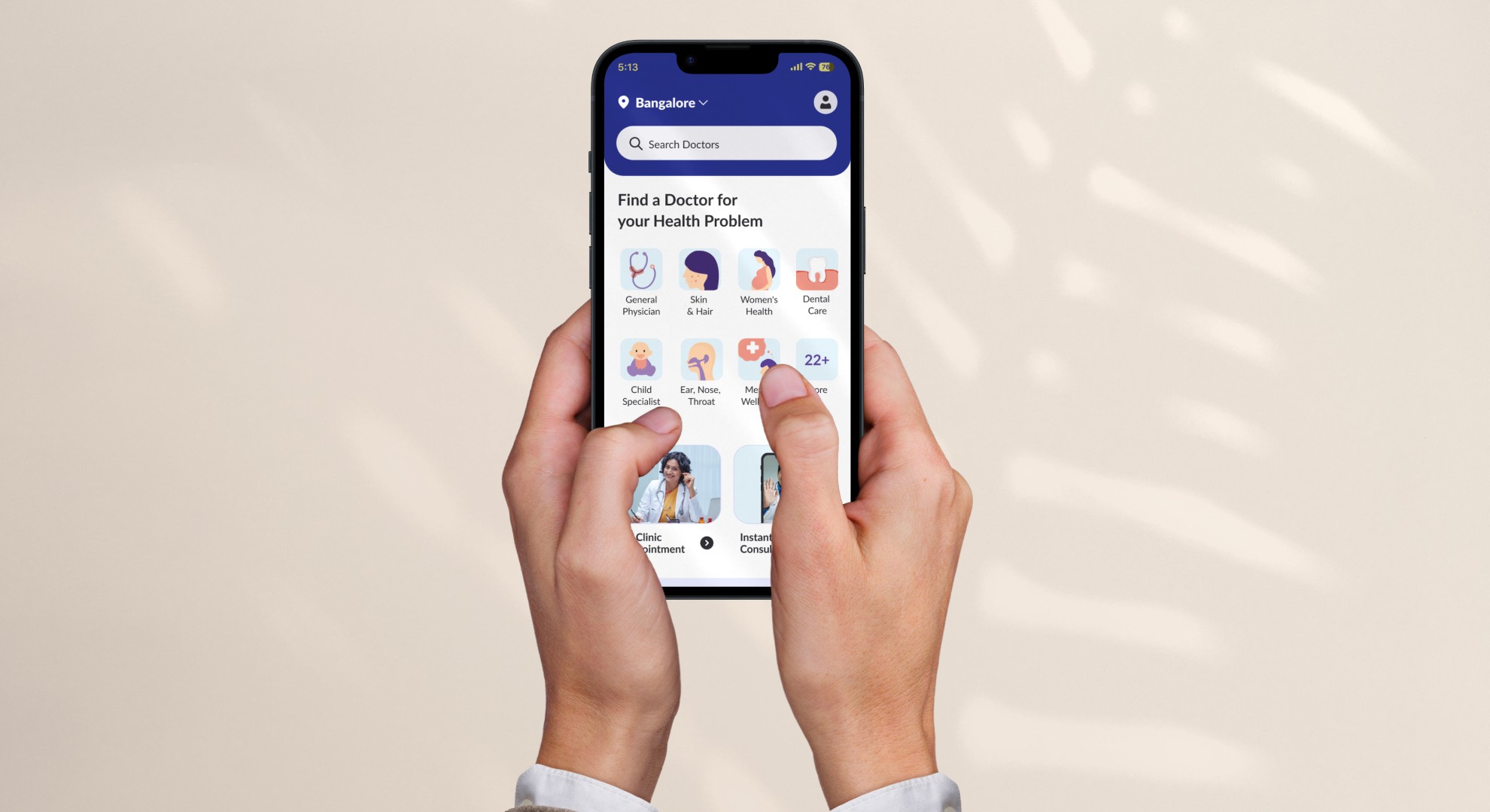
My task is to design the App Home page for this new focus.
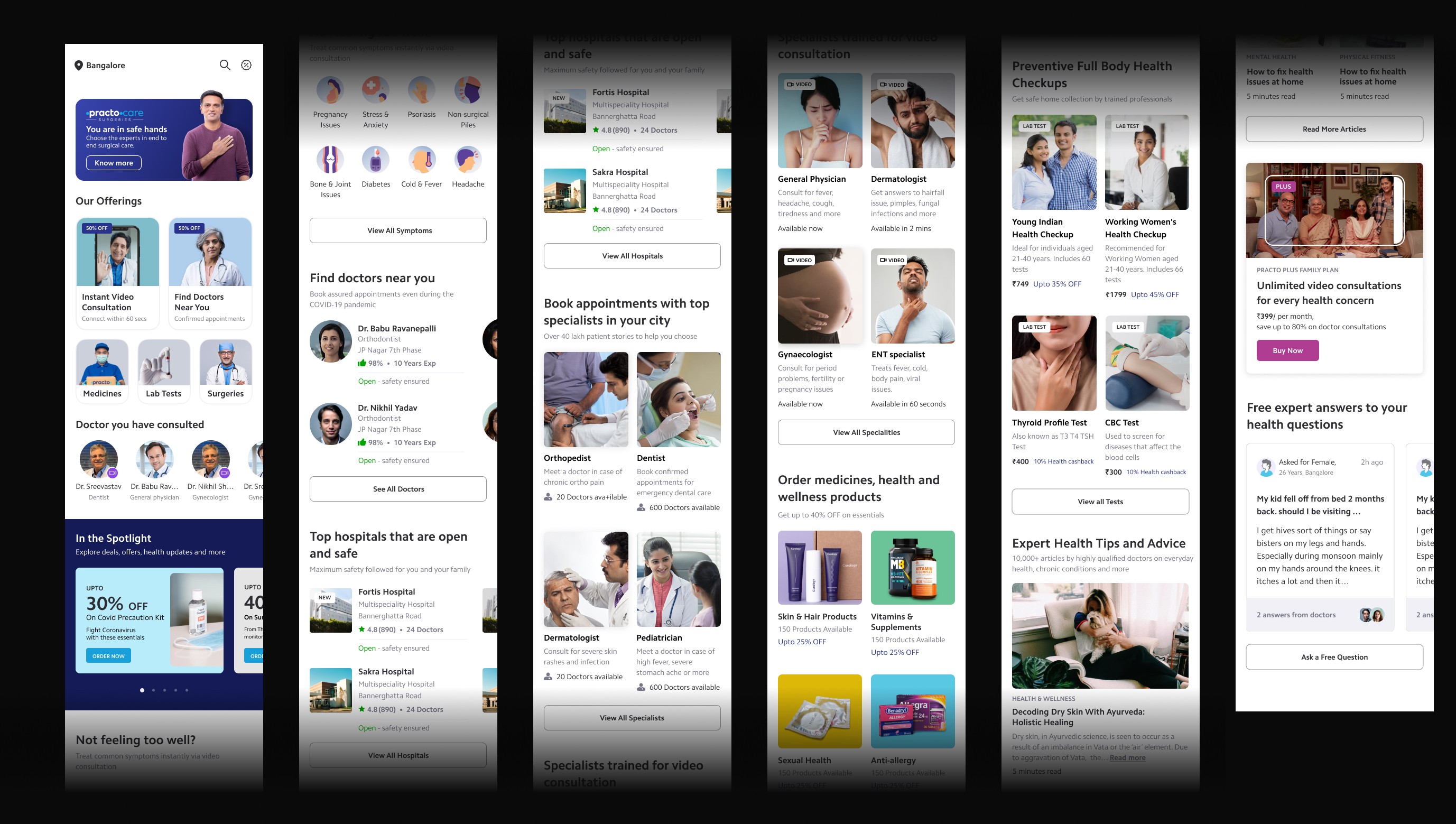
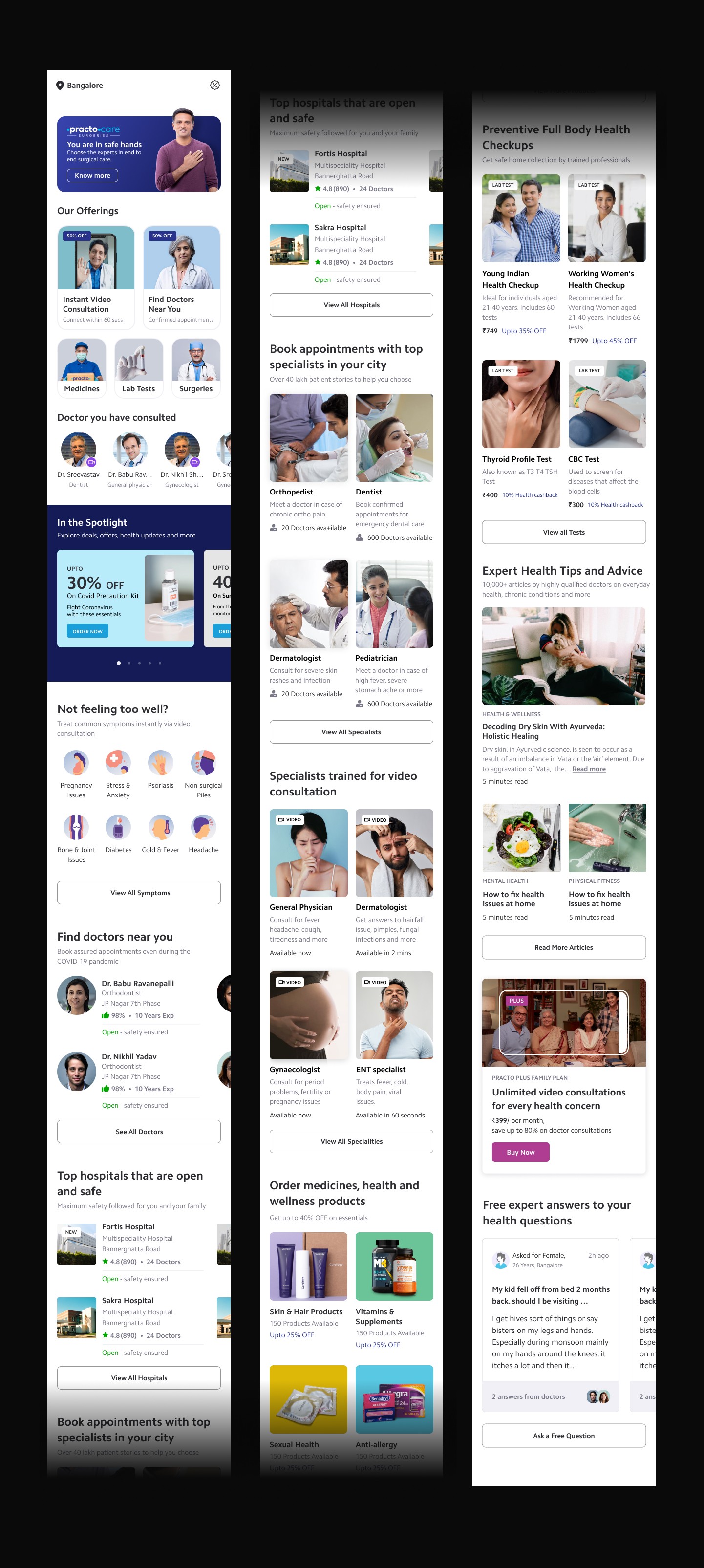
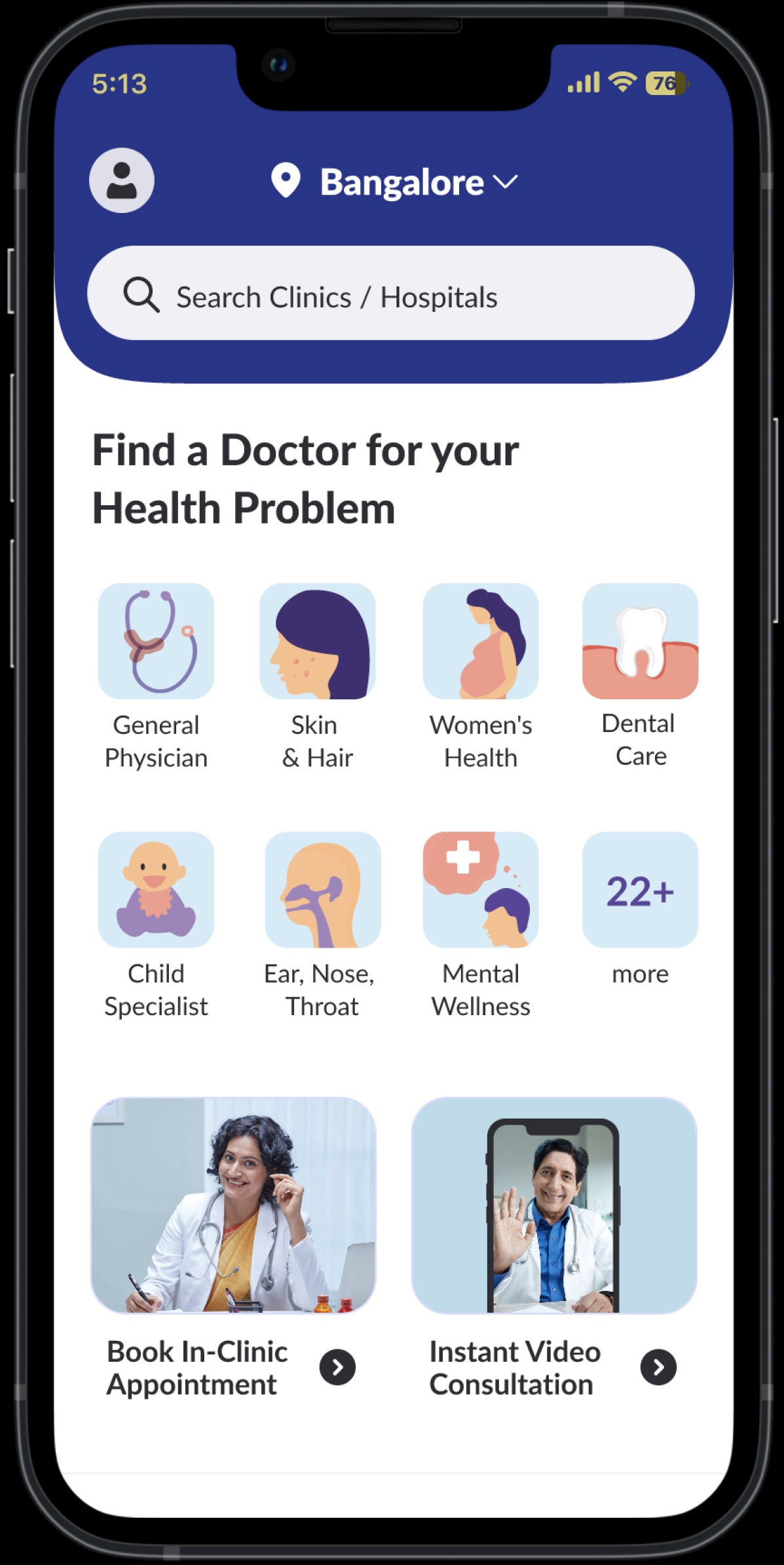
Existing app home full page
Problem statement
With Practo's expanding services, the app's home screen had become cluttered and inefficient.
Low visibility of crucial services like In-clinic appointment & video consultations.
Confusing navigation, leading to user drop-offs.
Low CTR on search bar
Problem statement
With Practo's expanding services, the app's home screen had become cluttered and inefficient.
Low visibility of crucial services like In-clinic appointment & video consultations.
Confusing navigation, leading to user drop-offs.
Low CTR on search bar
Low visibility of crucial services like In-clinic appointment & video consultations.
Confusing navigation, leading to user drop-offs.
Low CTR on search bar
Process
Process
Data Analysis
I ranked the sections of the existing page based on revenue contribution, which helped me identify the most relevant areas for optimization.
Data Analysis
I ranked the sections of the existing page based on revenue contribution, which helped me identify the most relevant areas for optimization.
Data Analysis
I ranked the sections of the existing page based on revenue contribution, which helped me identify the most relevant areas for optimization.
User Research
Conducted user interviews to understand general user behaviour, the products they use, and their decision-making factors when engaging with digital products.
User Research
Conducted user interviews to understand general user behaviour, the products they use, and their decision-making factors when engaging with digital products.
User Research
Conducted user interviews to understand general user behaviour, the products they use, and their decision-making factors when engaging with digital products.
Design & Validate
With prototype testing, I gathered feedback, refined the designs, and repeated the process to ensure the final solution aligned with user needs and business goals.
Design & Validate
With prototype testing, I gathered feedback, refined the designs, and repeated the process to ensure the final solution aligned with user needs and business goals.
Design & Validate
With prototype testing, I gathered feedback, refined the designs, and repeated the process to ensure the final solution aligned with user needs and business goals.
Core Problem: Navigating Patient
Behavior in Healthcare App Design
Core Problem: Navigating Patient Behavior in Healthcare App Design
Core Problem: Navigating Patient
Behavior in Healthcare App Design
The fundamental question I aimed to solve with the design was: Should the home screen guide users to choose between Clinic Appointment and Video Consult, or should it focus on helping them find their ailments/symptoms? Solving this required deep insights into user behavior.
The fundamental question I aimed to solve with the design was: Should the home screen guide users to choose between Clinic Appointment and Video Consult, or should it focus on helping them find their ailments/symptoms? Solving this required deep insights into user behavior.
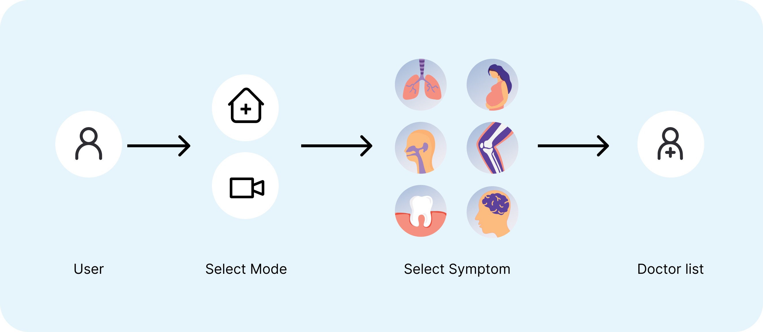
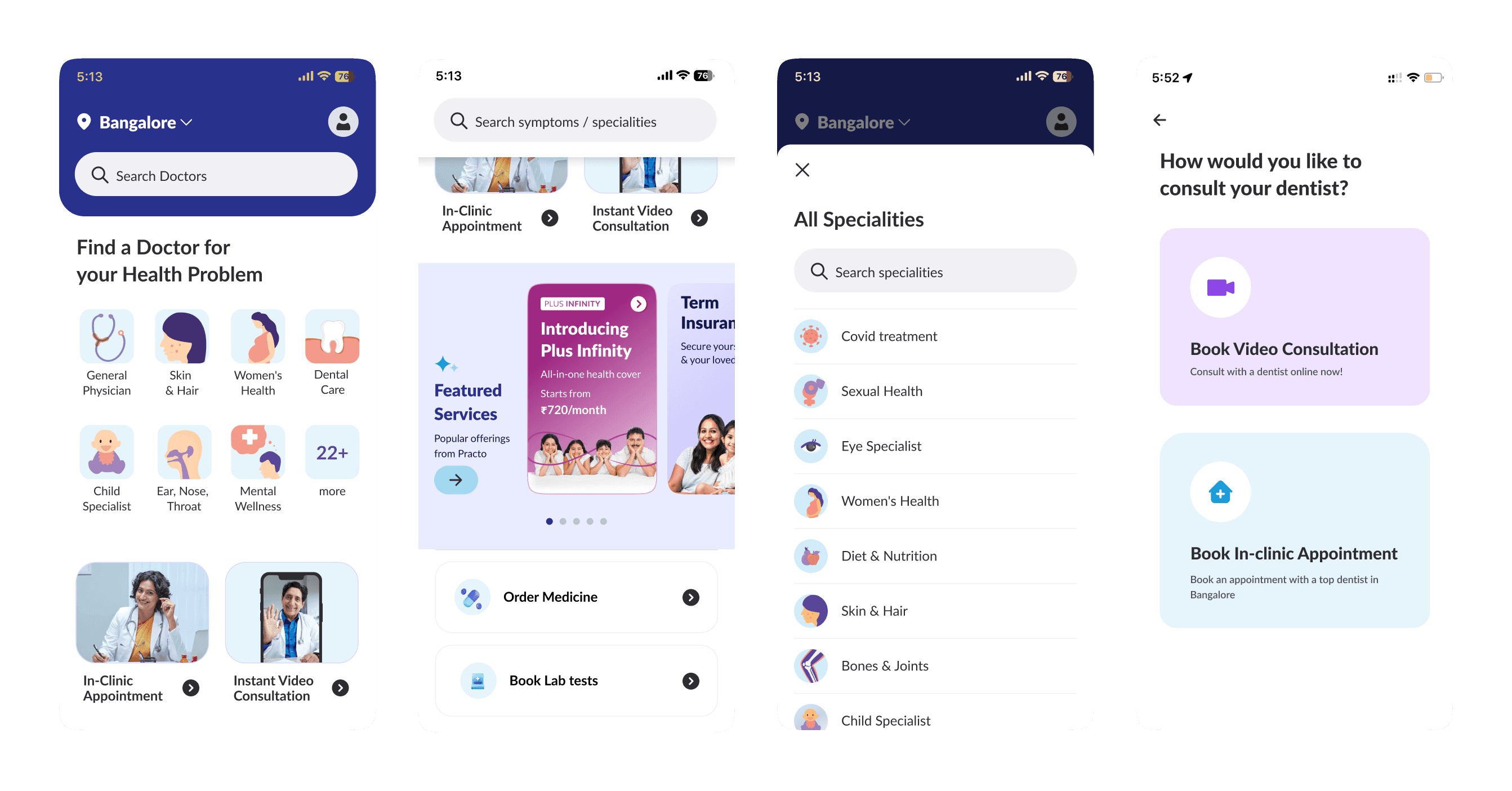
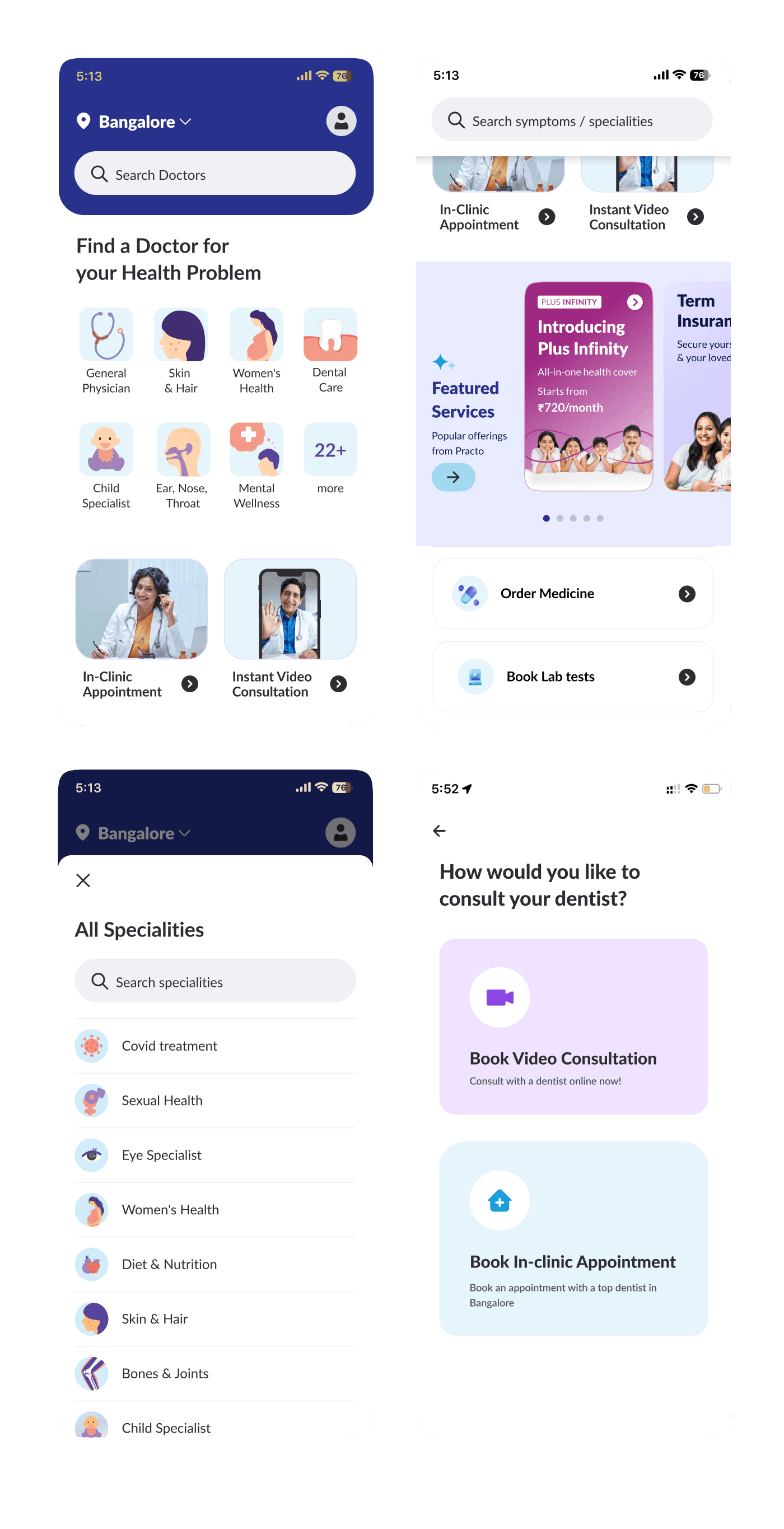
Exploration 1
In this approach, users have to first select their preferred mode of consultation and then identify their symptoms or ailments.
UT Outcomes:
Most users didn’t notice it, they tends to choose the ailment before even noticing the tab (mode). Hence the issue still persist
Exploration 2
In this exploration I want to explore whether users would prefer a bottom navigation to clearly distinguish between each consultation mode.
UT Outcomes:
This solution is also failed as the visibility of video consultation was very low and many people ignored them while UT
Exploration 3
This exploration allowed users to easily switch between doctors available for clinic visits and video consultations.
What worked:
Users were already familiar with the list page’s tabbed interface. This familiarity reduced the need for adapting to new navigation, allowing them to focus on finding the right doctor or consultation mode with ease.
Impact Metric
%
conversion
improvement
Lakhs
monthly recurring revenue
%
bounce rate reduction
Trade-off
We found that tabs for switching between physical appointments and video consultations were ideal, but due to tech limitations, we implemented an interim screen where users can choose between video or clinic appointments.
We found that tabs for switching between physical appointments and video consultations were ideal, but due to tech limitations, we implemented an interim screen where users can choose between video or clinic appointments.
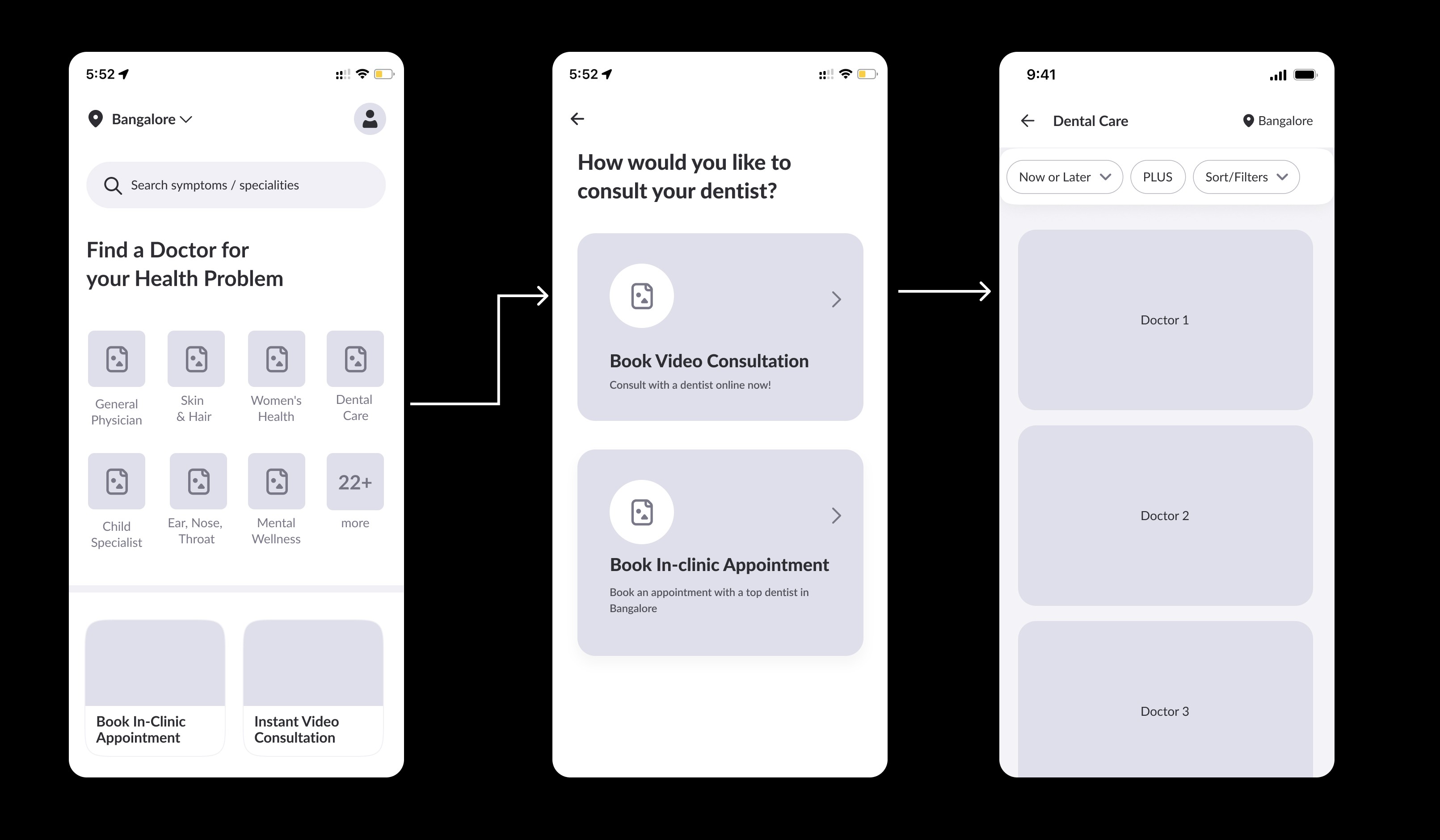
Even though this added additional step in the flow, the drop of at this page was negligible.
Even though this added additional step in the flow, the drop of at this page was negligible.
UI Mockup
UI Mockup
Impact Metric
%
%
conversion
improvement
conversion
improvement
Lakhs
Lakhs
monthly recurring revenue
monthly recurring revenue
%
%
bounce rate reduction
bounce rate reduction
%
%
search initiation
search initiation